Wigan Warriors' new badge will soon feel very comfortable, says designer


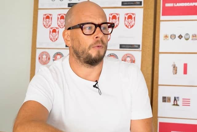
Stuart Watson, partner of leading design firm Nomad Studio, played a key role in creating the artwork for the club’s logo which was released on Sunday night.
He predicted the backlash on social media from many supporters resistant to switching the club’s traditional crest to the warrior design.
Advertisement
Hide AdAdvertisement
Hide AdBut having worked on other rebrands in other sports – including the Premier League – he hopes they will soon accept it.
“There’s always an outcry,” said Watson. “It’s natural to feel like that.
“But if we can get through that together and not buckle I think this will feel very comfortable very quick.
“I’d ask everyone to give it a chance, give it time, sit with it.
Advertisement
Hide AdAdvertisement
Hide Ad“I think when you see it in context – not out of context – it will feel right and it will feel comfortable quicker than you may imagine.
“When you see one next to the other you think, ‘Wow, it’s different’.
“When the Premier League logo launched, my mum saw it in The Sun and she cut it out, posted it to me and said, ‘It does nothing for me, love mum’!
“But when you’re seeing it on the pitch, on TV, on the shirts, it’s in context and it looks different to seeing it in the newspaper out of context.
Advertisement
Hide AdAdvertisement
Hide Ad“When you see players wearing it on their shirts, it’ll start to feel like yours quicker than you may imagine. There’s an immediate shock, at first, and then I think it’ll settle in and become part of the DNA of the club.” Watson, who hails from Bolton and studied at Wigan art college 25 years ago, stressed the original crest will still have a place as a marquee heritage brand.
But having been tasked with creating a modern badge for the digital world, he is proud of the design they created.
“A lot of time has gone into this. And a lot of the time is the journey – creating a fan group, working with them, getting their opinions, getting it wrong, going again,” he said.
“The badge we see now, there are probably 600 versions of that with miniscule changes. There are a million ways of doing the warrior and we got it wrong before we hit on the Brigante warrior.
Advertisement
Hide AdAdvertisement
Hide Ad“There are tons of warriors sports brands, a lot are looking at the side, we wanted this guy to be staring right at you.
“And once the Ws came into the beard, we thought it works great. The helmet is unique to the Brigante warrior – and there’s a historical connection with Wigan.”
The crest can also be used ‘modular’ – meaning just the central part, the shield with the Warriors face, can be used – which is useful when it is used small such as on a mobile phone screen.
“We want to be so on point, so wherever you see this – however big or small – it’s fit for purpose,” he said.
Advertisement
Hide AdAdvertisement
Hide Ad“So we create everything modular, so it can be stripped right back.
“We learned that with the Premier League, we won the pitch on saying, ‘You need to be a digital-first brand’, because everyone will be watching on phones. If you look at your phone you will see tiny logos which work, and some which don’t work.”
Wigan have made no secret of their desire to attract younger fans and they hope this crest will help them achieve it.
“We all buy brands which speak to us in some way,” added Watson. “There’s an argument to be made someone young coming into the sport wouldn’t connect with a complex, town badge.
Advertisement
Hide AdAdvertisement
Hide Ad“By creating something more modern and part of their lifestyle, it will attract a different audience. Change is not going to stop, you need to go with it or risk dying.
“We didn’t do this for our portfolio or ego, it’s to help Wigan move forward.”
Read unlimited Wigan Athletic and Wigan Warriors stories for less than 70p a week by subscribing to our sports package here